
Punk in
graphic design.
"The counter culture of the 1960s was vital
to the development of British graphic design," Shaughnessy believes.
"Not stylistically, perhaps, but in showing how imagery could be used for
subversive or transgressive purposes. I think it showed that 'graphic design'
could be art, and made to deliver messages and codes. It was the first time
that graphic design departed from the old British tradition of good taste and
good manners."
Along with
the rise of the punk scene, not only a new music genre has been developed.
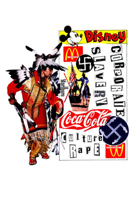
Punk was
famous for its DIY visual style which combined a variety of media through a
collage method. Graphics of this sort would combine photocopying with stencil
work and a font mixture, referred to as ‘anonymous’ later on. Another style
associated with the punk music was the ‘grunge’ – dirty, torn up graphics.

God Save the
queen, one of the most iconic images of the punk culture featuring the ‘anonymous’
font.
A fine
example of the DIY sense to punk was the Sniffin Glue magazine

Punk
movement had equally significant visual style associated with it. As it was
introduced in the mid 60s, which was a thriving period for various
post-modernist graphic styles it drew inspiration from many significant visual
movements.
The rich and
striking colour combinations typical for the psychedelic art were present in
majority of 60s works.

To a great extent, the art of punk is associated with Jamie Reid. Reid was to graphic design exactly what punk movement was to music/society.
"Although Reid is known primarily for the deployment of Situationist strategies in his iconic work for the Sex Pistols and Suburban Press, the manifold strands of his art both continue that work whilst showing us other ways in which we can mobilise our energy and spirituality. It is this dialectic between gnosticism and dissent that lies at the heart of Reid's practice and makes him one of the great English iconoclastic artists."
Further works of Jamie Reid:

0 comments:
Post a Comment